Paint, Palettes and Everyday Balance
8 years ago by

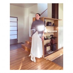
In honor of Home Month at the Atelier, we wanted to dig a bit deeper into how Garance’s home redesign is all coming together—from appliances and paint, to the inspiration behind the design choices. Read on to hear all about Garance’s paint selection from HGTV Home by Sherwin-Williams and what inspired her and Sarah Sherman Samuel when choosing the color palette.
—
What can you attribute to being the inspiration for the space?
Garance: To me, the inspiration is the inside / outside life of California and how we wanted to play with LA’s incredible light which is wonderful – but sometimes too much. In any home, you need places of brightness and places that convey a sense of shade and protection. Paint is a wonderful tool to create that.
Sarah: Garance herself was my inspiration for the space, my muse! Her personal style, her work, heritage, travels, and the way she wants to live her life are all considered in the space. Combining the above with my design aesthetic and our mutual goal to create something that you don’t see everywhere, everyday.
How did you approach the established HGTV Home by Sherwin-Williams “Everyday Balance” Color Collection with the intention of incorporating it within Garance’s home?
Sarah: We were already part way through the design process when we were introduced to this palette, and by happenstance, a few of the colors were already worked into the design. We took the cues from the full “Everyday Balance” Color Collection to work in accents in the selected hues.
How did you go about pairing the subtly contrasting hues together?
Garance: The palette literally fit like a glove in my house. As I said it is very important for me to bring different shades.
Sarah: We did this by going bold and using a large amount of one color in one space, then paired that with very small accents of a contrasting hue.
Which of the colors from the “Everyday Balance” Color Collection stood in as the primary options and which were earmarked as the supplementary tones? Can you expand on how you went about designating each tone within, and why?
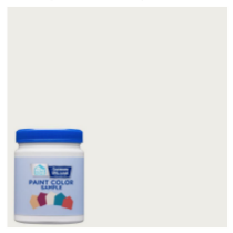
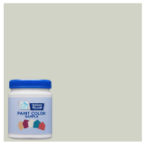
Sarah: Dark Night is a gorgeous green that stood out as the winner for the master bedroom, as it fell right into our design plan. The same inspiration came through with Pure White and Quaint Peche, a peach-toned pink, throughout the main living spaces and Garance’s office respectively. Borscht, a deeper red, was selected as supplementary tone, and Dark Night came through once again as an accent—they pack a big punch with just a small dose.
We selected Pure White for the main living spaces to help reflect as much light as possible and bring a crisp brightness to those rooms. Dark Night was perfect for the master bedroom, as Garance wanted it to be as dark as possible when she sleeps, and it is a beautiful alternative to charcoal or black. And finally, Quaint Peche in the studio creates a subtle feminine swath of color.
Can you speak to how you managed to seamlessly integrate such a wide array of hues within one space, without risking an overwhelming end result?
Sarah: The great thing about the curated Color Collections from HGTV Home by Sherwin-Williams is that the colors within the palettes are designed to work together in any combination. This makes it easy to bring a designer look into a space, whether you are a designer or not. We personally did this by carefully selecting which colors touch or overlap with other colors, by balancing the contrasting colors throughout the space.
How did you decide between which of the tones would be utilized for the walls versus the decorative accents or furnishings?
Sarah: We selected the colors we were most drawn to to highlight the walls.
Since the “Everyday Balance” palette skews towards a neutral scheme, how did you create interest using the tools you were given?
Sarah: The best way to create interest with a neutral palette is by layering in different textures as well as really concentrating on interesting forms. So we brought in these complementary accents to really bring the collection to life, and create a series of balanced, beautiful spaces in Garance’s home.


You may also like


Garance
From the Archives: The Party


Features
Le Credo de Garance


Beauty
Garance Doré’s Winter Edit


Beauty
Garance Doré’s Fall Edit


Lifestyle
Erin Kleinberg’s Peaceful Oasis


Garance
Our New World