For the Love of Color
7 years ago by
If you follow me, you’re probably familiar with my illustrations. And you know they’re usually in black and white. That happens to be my style, but it’s also (and mostly) because I think there’s a whole art to working with color.
Mixing color is a real skill, and for me it’s one of the most difficult. That’s why people go crazy for the colors in Saint Laurent. Making colors clash, bringing them together, making them communicate, knowing how to let them express themselves – it’s really a whole other world.
When I was thinking about renovating my home, I had California in mind, and the peace I came here to find. To me, a home is a representation of who we are. So, at first, true to my taste, I was envisioning nothing but white and neutral colors.
But over time, as I had more experience living with the sun, I began to realize that here in Los Angeles, light is everywhere. Sometimes you feel like protecting yourself from it.
And colors can be real allies.
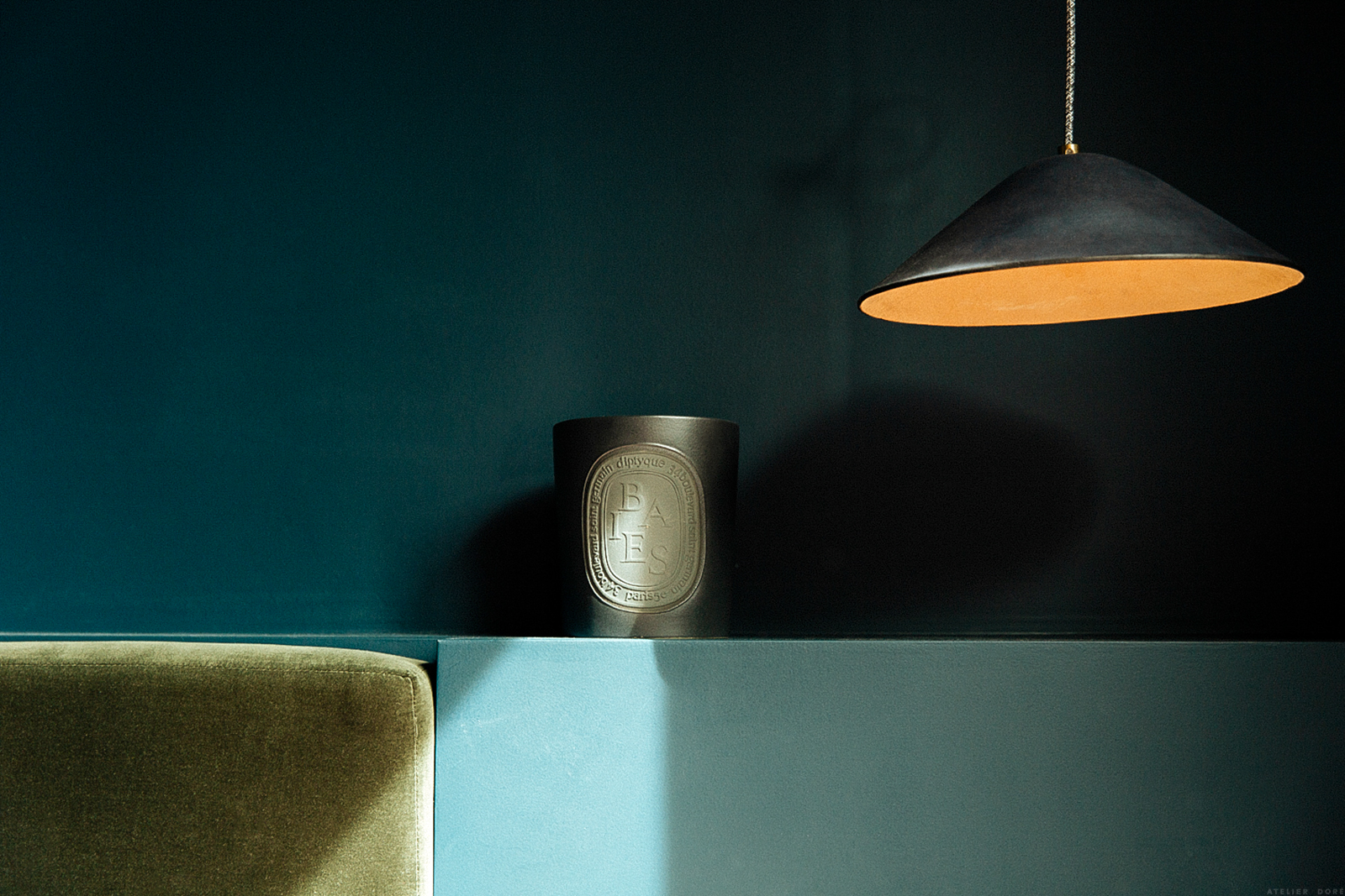
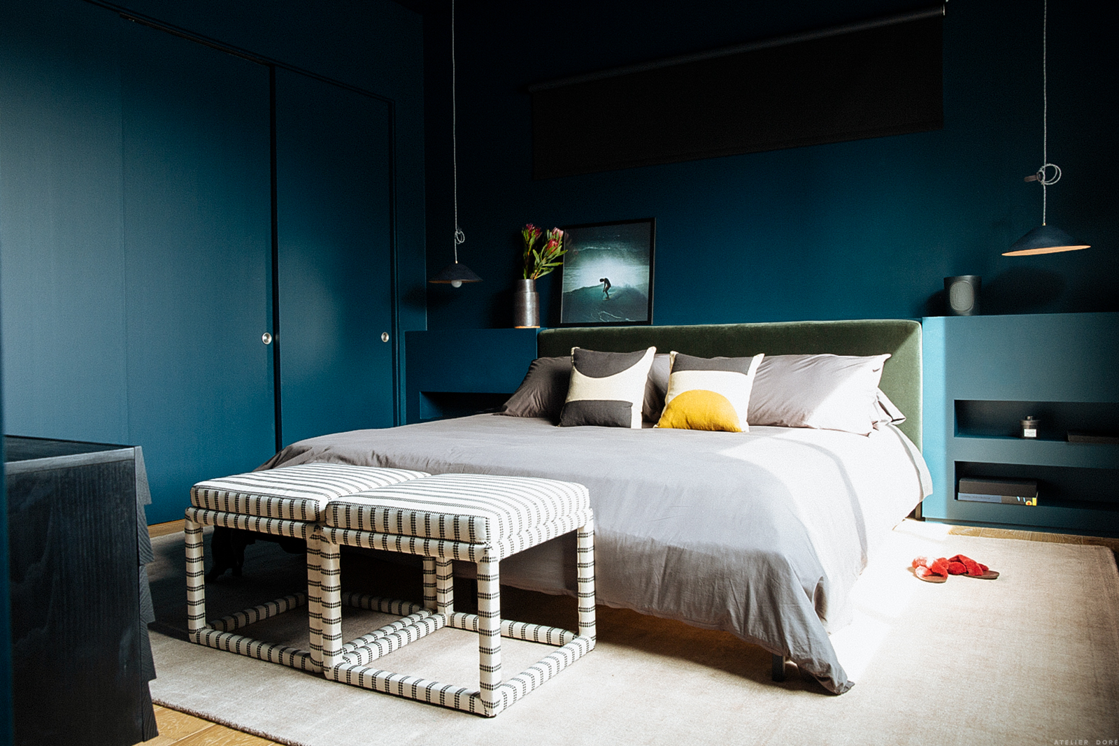
I started to imagine a room in contrast to all that white. I’d decided to really start taking my sleep seriously, and I wanted to create a dark, deep, welcoming space. A room just for me – and if you really want to know all the details — a room that symbolizes our interior worlds. The yin and the yang, the balance between shadow and light.


That idea moved me to rethink my desire to make everything white. What other rooms could I bring to life with color?
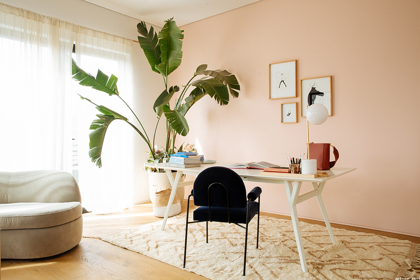
My studio was the first thing that came to mind. But, that brought up an entirely different question. My studio is located at the southwest corner of the house and has enormous windows… so the light can sometimes be blinding.
I wanted to maintain that luminous, bright energy, but I wanted to absorb it and soften it a little… So, what to choose?
That’s when I decided to use a Color Collection.
When you’re an illustrator, you often use color palettes as a tool for putting colors together, and as I was saying before, color can be intimidating…
But, no need to be ashamed. Even the greatest artists use color palettes. Sometimes it’s just a starting point, a place to find inspiration.
And sometimes it’s the basis for an entire work of art.
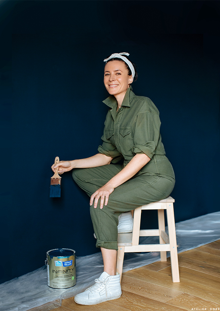
When Sarah and I discovered HGTV HOME by Sherwin-Williams’ Color Collections for 2019, it didn’t take us long to decide which one would work best for us. The “Everyday Balance” palette has just about everything we’d been hoping for. Dark colors alongside soft, soothing colors. Just what I’d been dreaming of.
So, I threw myself wholeheartedly into this new color scheme and honestly, the results blew me away. Not only do the colors work super well together (thank you, Color Collection!), but the ambiance is exactly what I was looking for.
Depth and softness.
My mantra for 2019, basically!


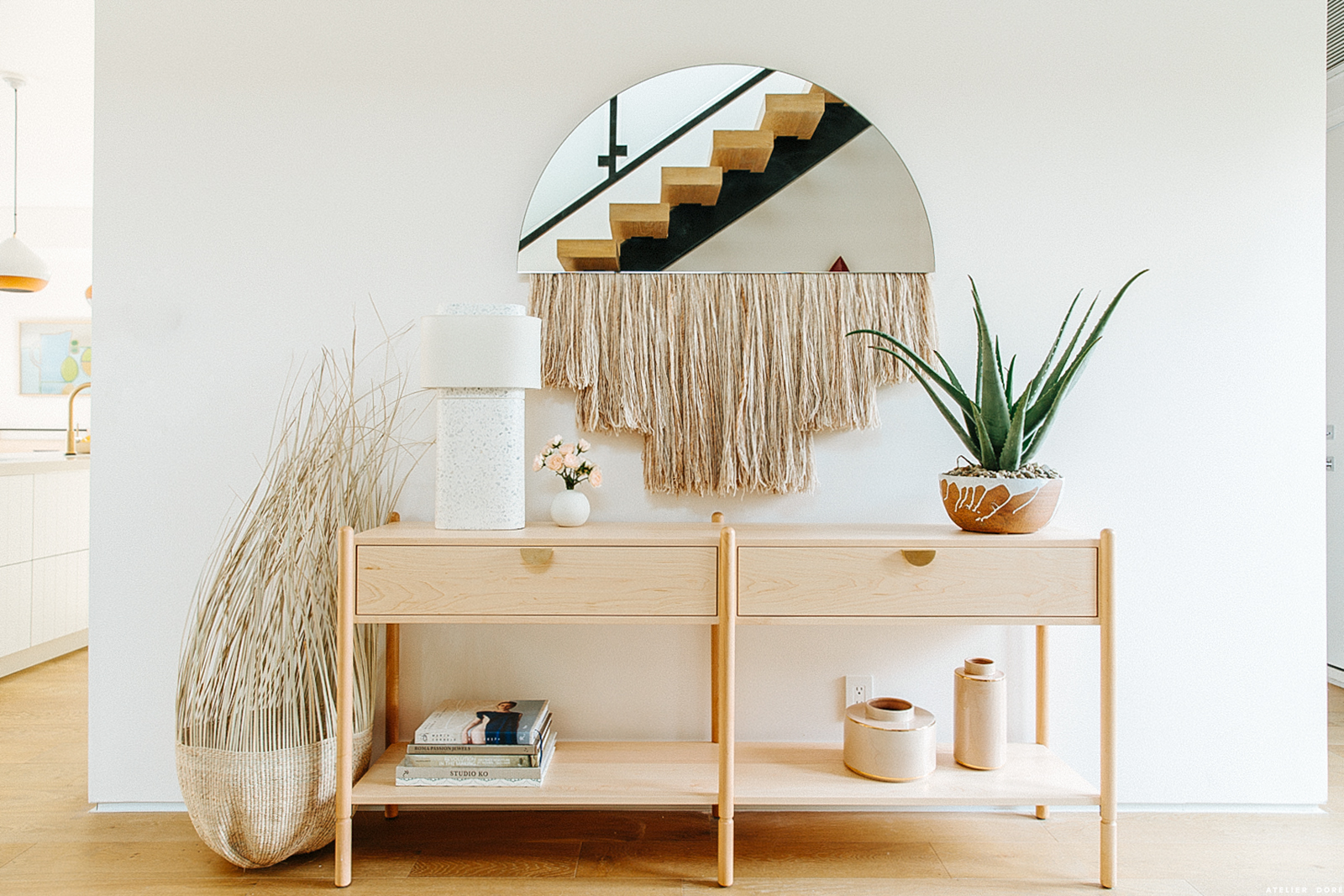

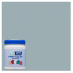
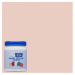
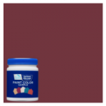
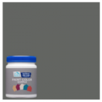
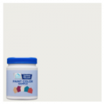
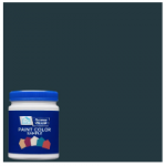
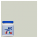


















c’est magnifique! On imagine bien la quiétude de la pièce une fois les volets rabattus, à l’heure de la sieste quand le soleil s’enrage dehors…
I can appreciate the need to keep developing style, content and message of a editorial product over the years, but after regularly reading this site since about 2008 I can’t help be disappointed in the commercial direction that Atelier Doré has taken both in the visual and writing-style. Up-front and original content has become few and far between, and has clearly taken a back seat to advertorials. To me the mixing of sponsored content and articles obviously meant to engage the demographic also feels insincere even though it’s clearly marked.
Nothing against the new home, of course. It’s beautiful.
Chouette, chouette un article déco! Je suis aussi en plein dedans, à mon échelle, un appartement à Marseille, mais votre très belle maison est source d’inspiration…, Et je suis ravie de lire votre plume plus souvent sur votre site!
Garance’s home reminds me so much of the sea – it has this beautiful, almost carefree feel to it. LOOOOOVE!
Natalie
http://weandno.com
I will embark on doing it. Hope you can continue to contribute your talents in this area. Thank you.
The author clearly describe all the parts of the article with good language and information. Looking forward to another article.
your house is just absolutely stunning and serious decor goals – so considered and the colour palette is stunning
Mel x
https://mediamarmalade.com/
Very beautiful and soft design. I love the combination of dark and pastel colours. The furniture in natural colours and soft lines is amazing.
Tout simplement, j’adore votre maison. Un cocon reposant pour les yeux et l’esprit
Fan de ce bleu ! belle inspiration pour mon futur bureau !
This is good
This is really good
I love this color and the surfer photo-what is it? where can i find it? thank you G!