The Ventura’s West Village Loft
7 years ago by
Ohhh Michael and Caroline (and Darryl!), how do we love thee? Let me count the ways. One. Two. And three.
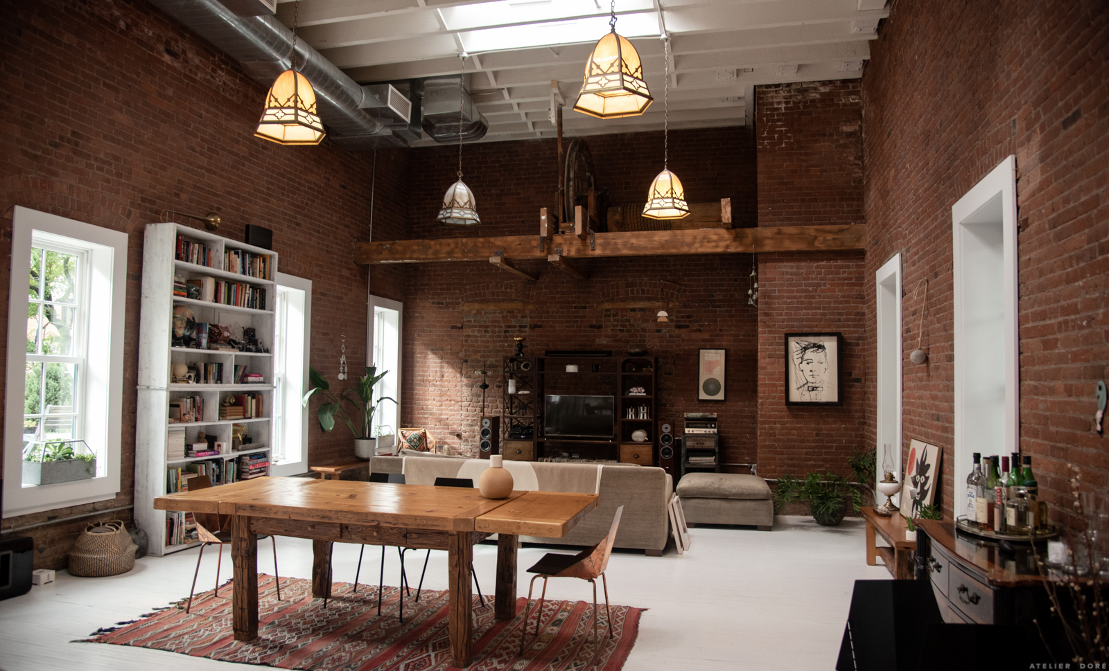
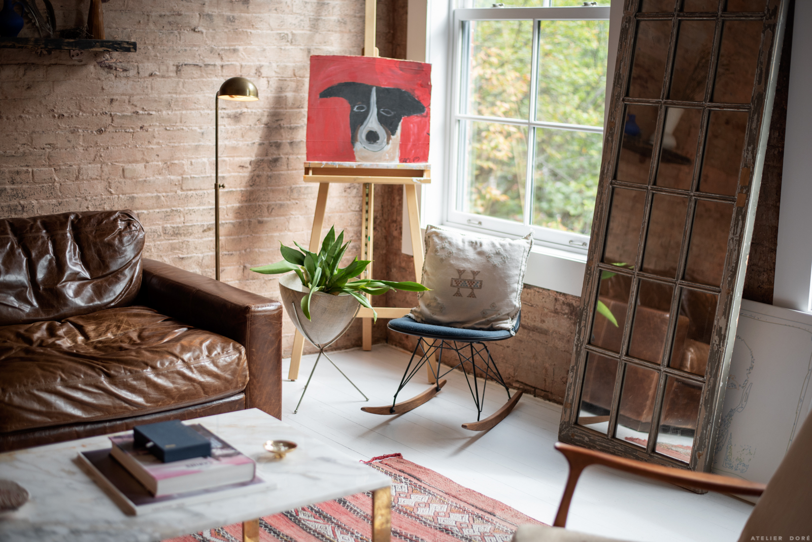
We couldn’t resist a little interior shoot with this family. It doesn’t hurt when their home is a loft in the West Village full of character, history, and Caroline’s soothing art. Take a peek for yourself…


Can you tell us a bit about the history of your space?
The building was originally a ship chandlery in the 1800s. The ground floor used to sell supplies like rope, candles, and general things you’d need for a boat. The second floor was a sort of flop house for sailors to stay while they were in town. And the third floor, where our apartment is, was where they made and repaired sails for the ships. There’s still some original elements leftover from that time; in our living room there is a giant winch in the ceiling that was used to hoist the sails up and down. It’s definitely a weird, but cool thing to have up against your living room ceiling.
While furnishing your home what was your design ethos? Did you have any specific aesthetic or functional goals in mind while outfitting your home?
The apartment we had prior to this was teeny. Like, 600 sq ft teeny. So, when we moved here we were really overwhelmed with how much space we had to work with (tough problems). We differ in opinions a little when it comes to our approach to decorating. Michael is a Cancer and he needs to feel at home immediately. I’m a Pisces so I like to take my time with things and dream big. So as you can imagine, there was a lot of compromise when it came to how fast we were going to buy furniture for the larger space.
I don’t think we have a specific aesthetic–we both like antique and vintage pieces, but also love a minimal mid-century look. Most of the the things in our home have a story to them and were either designed by us personally, or were picked up from our adventures. We like to travel as often as we can, and when we do, we always bring back some little (or big) things to add to our home.


Caroline, can you talk a bit about your art and your work space in your home? What art have you been working on recently? Do you have a specific creative routine that your home supports?
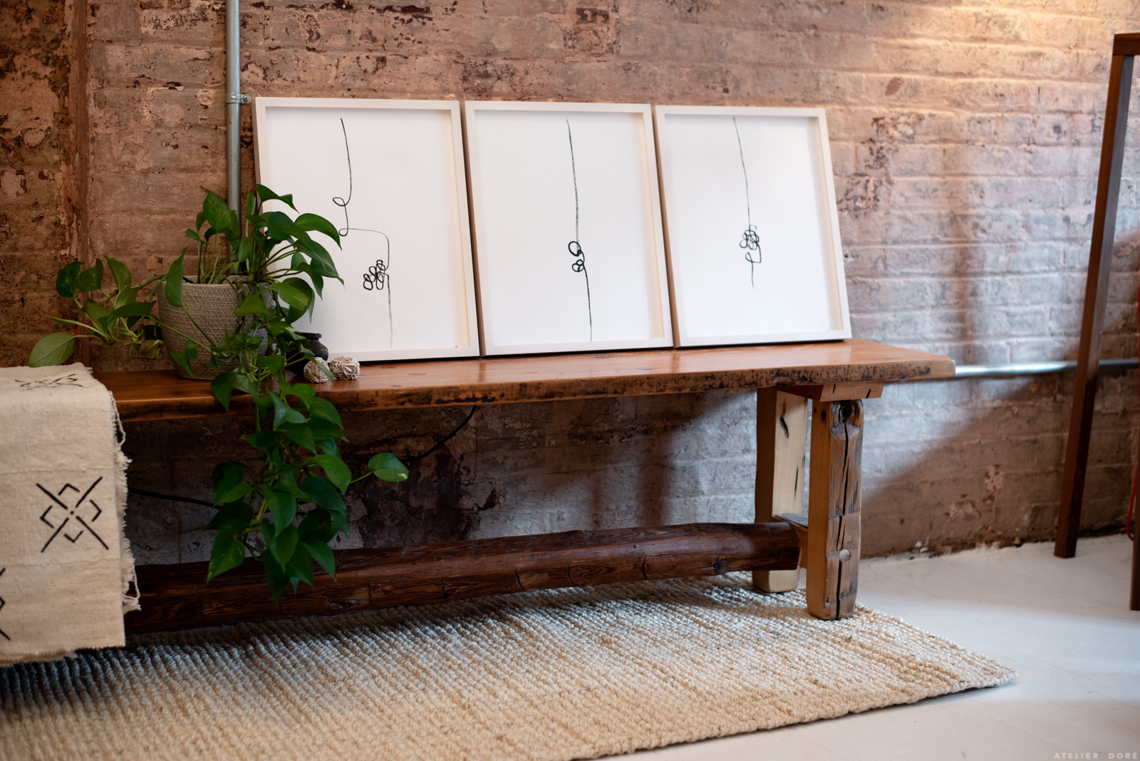
I’ve really been getting into my painting practice a bit more over the last year. At first it was just something that I did for fun, but in the last few months I’ve started to focus on having it become another facet of my professional life. Most of the time I paint at home. I’ve carved out a little nook in our sitting room, under the stairs. That room has a feeling of real quietness. It gets a lot of light. And because there are no electronics in there, it just feels gentle and quiet, which is a feeling I try to evoke in my work.
My pieces are really simple. Most of them are a meditation practice that I do with my non-dominant hand. I had a stroke when I was 23 (this is a longer story for another time, ha!), and it affected my motor skills on my right side, which is the hand I use to write. I slowly taught myself to become left handed with everything except writing, so the line drawings I am doing are an attempt at learning how to be fully ambidextrous. It’s a frustrating process but I feel good about it!
October’s editorial theme is “relationships.” Any advice you would give to couples who are moving in together for the first time? Your Dos and Donts of cohabitation?
When we moved in together, Michael had already been living in his apartment for quite a while so it felt a lot like I was moving into “his space”. It was difficult for me in the beginning because so much was already in the apartment and there was little we were able to change immediately. I found myself referring to it as “his apartment” a lot, which takes all the fun out of moving in together! Over time we redecorated the whole apartment and made it our own but it took a while.
Biggest piece of advice: make space for one another to share together, but also make space just for yourself and just for your partner. For both of us, it’s super important to have an area that is just ours. For Michael, it’s his meditation area off of our bedroom. For me, it’s my painting table. Also, if you can, get a new mattress together. Don’t sleep on one that had any involvement in a previous relationship. You don’t need to drag that weird energetic baggage of where someone else slept into your new home together ;)


Your favorite spot in your home?
The kitchen is the area that everyone seems to gravitate toward. When we have friends over, oftentimes we just hang out at the kitchen counter snacking, and drinking, and talking. The front room is also a space that we both love to spend quiet time in. Darryl really loves to just be in any room where there are people. But, he is also partial to our bedroom where “the people bed” is, aka: Darryl’s bed.
Three words you would use to describe your home?
Our safe space.



























*_*
Super loft. J’aime beaucoup les ombres et la lumiere sur les murs en brique, les fenetres donnant sur le jardin.
Bel espace dans lequel je pourrais emmenager aujourd’hui ! :-)))
I can’t believe it- I just bought almost exactly the same table and similar chairs, and have been wandering if a rung under the table would be a good look :) Thank you for this post- I’m off to buy a rug :)
Ana
http://www.champagnegirlsabouttown.co.uk
Beautiful place. But no photo of their favorite spot in the loft – the kitchen. Would love to see it.
Amazing space! And perfect decorated! In love!
All these profiles of one couple make me think that maybe you could use some recommendations for new people to check out? This one, in particular, reminds me of my friends Emily Katz (@emily_katz) and her fiancé Adam (@goldenruledesign). Style wise, Adam & Emily are more maximalist/boho, but the intentionality of their relationship and mutual dedication to aesthetic seem very similar. Anyhow, just some other folks to check out.
I like the warmth of this space. It is all very personal and I love that about it. :)
Wonderful place to live! Beautiful stuff!
Their loft is my absolute dream space! Been obsessed with industrial, exposed brick for a while, and their aesthetic is right up my alley.